UPON A DREAM
ORIGINAL FONT
CHALLENGE
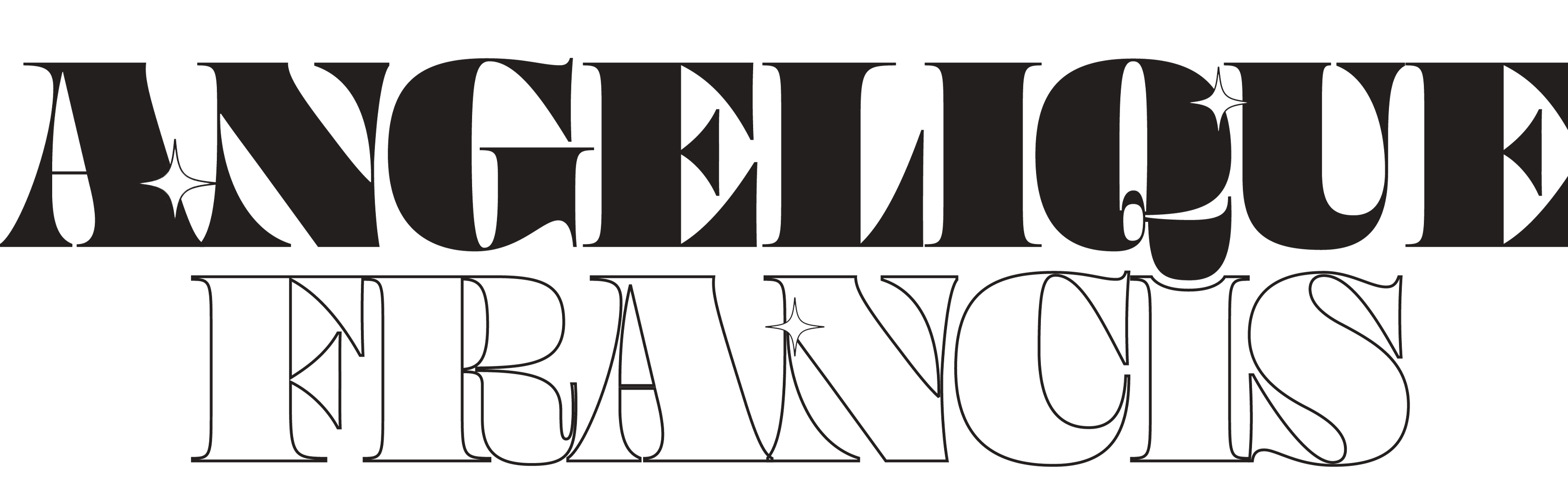
Sleeping Beauty is an animated fantasy film produced by Walt Disney in 1959. The movie took six years to make because each frame was an independent work of art. The film utilizes blackletter typography for the title of the movie. Blackletter, also known as Gothic script, is an ornate, bold style of type that incorporates harsh angles. Blackletter typeface was used in the Gutenberg Bible, one of the first printed books in Europe. What would a layered, Sleeping Beauty-inspired blackletter font look like with contemporary influences?
SOLUTION
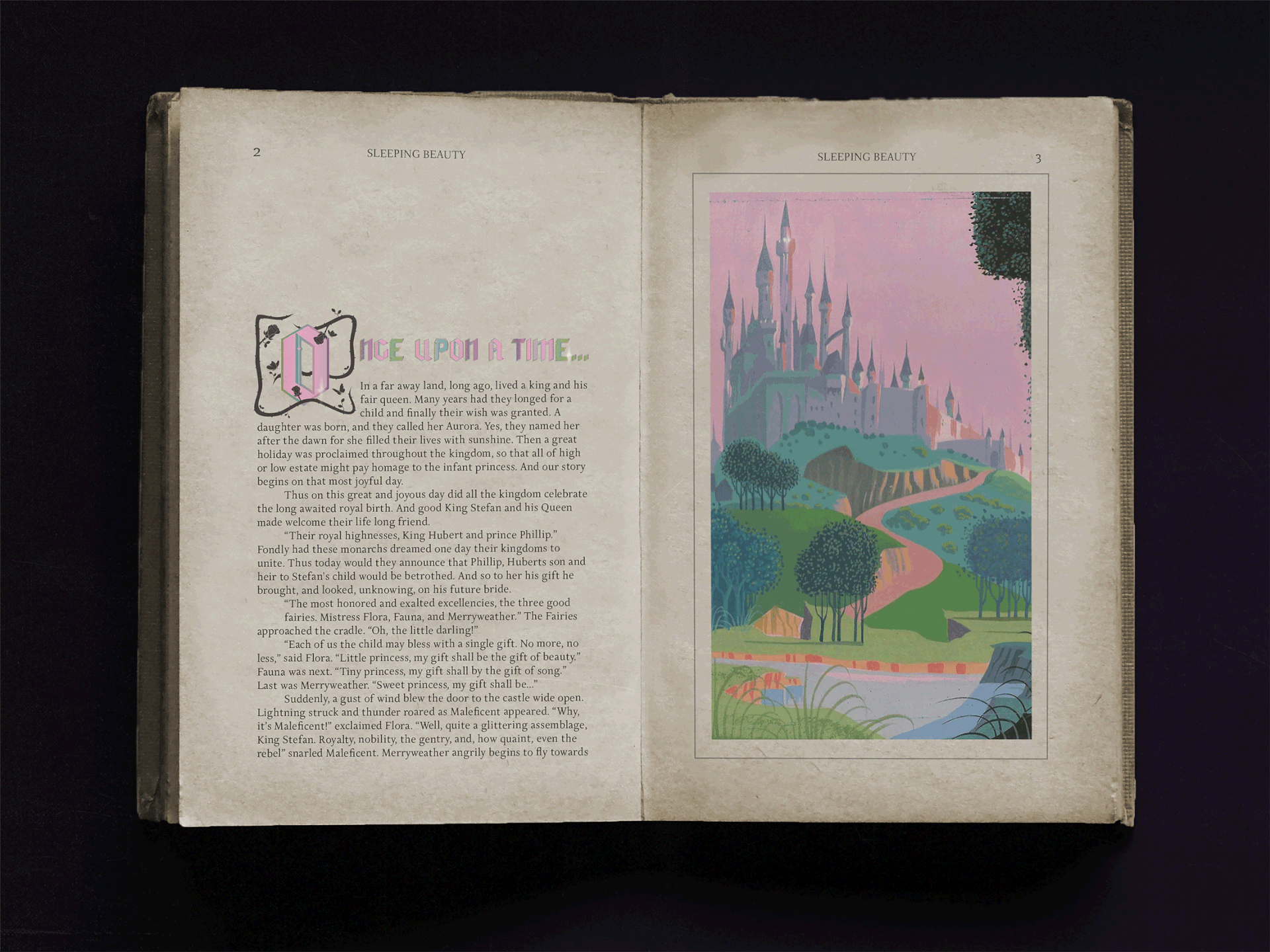
A 30 degree downward angle stroke became the foundation of Upon a Dream. The chrome shine reflects a dreamy quality that accurately represents the font’s name, Upon a Dream, which comes from the name of the primary song in Sleeping Beauty. A fairytale storybook open to the first two pages of Sleeping Beauty is used to apply Upon a Dream. This spread features a still from a scene from the film and the font being displayed in an illuminated initial and the beginning of the story. Upon a Dream is a font manifestation of the relationship between blackletter and femininity.
CLIENT Student Project
SKILLS Adobe Illustrator, Typography, Glyphs, Adobe Photoshop
